Adler.
The design system of Faculty Platform

I. Overview
During Faculty's rebranding process, it became paramount to establish a comprehensive design system that would facilitate a seamless transition across both the product and marketing materials.
Given the early stages of the platform, I initially began developing the design system gradually. However, with the rebrand launch date fast approaching, it was essential to devise a more efficient strategy for its implementation.
The overarching goal was to unify all design components within a centralized repository, ensuring consistency and scalability. To achieve this, I focused on creating tokens that represented the new brand assets. These tokens served as standardized elements that could be easily applied throughout the platform, maintaining a cohesive visual identity.
A significant aspect of the implementation process involved re-skinning all components and pages of the platform with the new assets. This entailed updating the visual elements while ensuring they seamlessly fit the intended layout.
This meticulous effort aimed to harmonize the platform's appearance with the rebranding guidelines, reinforcing the new brand identity and enhancing the overall user experience.This allowed for a smooth transition during the rebranding process and ensured a consistent and engaging experience for both product users and consumers of our marketing materials.

II. Process
To adequately prepare for this endeavor, the head of the front-end team and I attended a three-day crash workshop focused on design and development in design systems. Our journey began with a deep dive into the "big three" elements of design systems: typography, color, and icons.
Regarding typography, I meticulously examined all the font styles currently in use, filtering out those that did not contribute significantly to the overall design. Through this process, I established five distinct styles that would be consistently employed across our designs, ensuring a cohesive and visually appealing aesthetic.
The study of colors was an essential step, during which I dedicated time to understanding accessibility and functionality aspects for each color. This knowledge was instrumental in defining color tokens that could be consistently applied throughout the design system.
One area that required particular attention was the inconsistency in the icons used across the platform, suggesting that they were created by different individuals. Taking a pragmatic approach, I focused on redesigning the major icons to establish visual coherence within a specific icon family. Simultaneously, I made a note in the design system roadmap to address the redesign of the remaining icons.
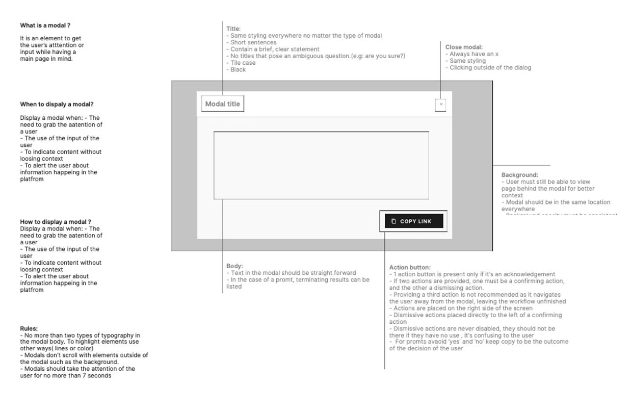
In terms of components, I undertook the task of grouping similar ones together and analyzing their composition. This exercise enabled me to identify design patterns, layouts, and existing components that could benefit from improvement, ensuring a more refined and efficient design system. An essential aspect of this process was reaching an agreement on standardized terminology. Collaboratively, the design and front-end teams dedicated time to aligning our language and ensuring consistent communication.
To gather valuable feedback and introduce the rebranding effort, I facilitated a feedback session with both the product team and the leadership team. This served as an opportunity to familiarize the front-end and back-end teams with the rebranding initiative, encouraging open dialogue and setting the stage for a successful implementation.


III. Handover and next steps
Once the design system gained a more solid footing, I collaborated closely with the front-end team to begin implementing the design tokens into our repository.
My role revolved around ensuring that the components in Figma align with the tokens present in the design system repository. This involves meticulously updating and maintaining the design components to reflect the standardized visual elements defined by the tokens.
In addition, I take the initiative to create new components specifically tailored for designers to utilize in demos and presentations. When these components have the potential for reusability, I proactively communicate this to the front-end team, facilitating their smooth implementation into the development process.
By upholding this continuous cycle of collaboration and synchronization between design and development, we strive to maintain a cohesive and efficient design system, enabling seamless communication and efficient design-to-implementation workflows.


IIV. Restrospect
Reflecting on the creation of our design system, there were areas where improvements could have been made to maximise its impact. One notable aspect was the timing of feature creation and release. Pausing feature development for a brief period would have allowed us to transition seamlessly from the old design to the new one and incorporate valuable feedback from users. This approach could have streamlined the process and ensured a smoother implementation.
Furthermore, convincing leadership of the significance and benefits of implementing a design system required persistent efforts and time. In hindsight, investing more time in communicating the value proposition and long-term advantages to the organisation could have resulted in more enthusiastic buy-in from leadership early on.
Overall, recognizing these areas for improvement enables us to learn from the experience and apply these insights to future projects, ultimately enhancing the effectiveness of our design systems and making a greater impact in our work.
IV. Restrospect
Reflecting on the creation of our design system, there were areas where improvements could have been made to maximise its impact. One notable aspect was the timing of feature creation and release. Pausing feature development for a brief period would have allowed us to transition seamlessly from the old design to the new one and incorporate valuable feedback from users. This approach could have streamlined the process and ensured a smoother implementation.
Furthermore, convincing leadership of the significance and benefits of implementing a design system required persistent efforts and time. In hindsight, investing more time in communicating the value proposition and long-term advantages to the organisation could have resulted in more enthusiastic buy-in from leadership early on.
Overall, recognizing these areas for improvement enables us to learn from the experience and apply these insights to future projects, ultimately enhancing the effectiveness of our design systems and making a greater impact in our work.